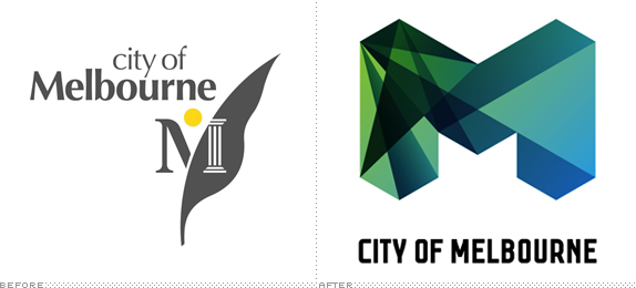


Im going to come straight out with it, i think this logo is shit, rubbish, especially for that amount of money. But the thing that leaves a bad taste in the mouth is that its done by Landor in Sydney yes Sydney. I thought Melbourne was meant to have its own culture with a thriving arts/design sector, surely a Melbourne based studio could have been commissioned!
So its an improvement on the old design, but that wouldn't have taken much. Its not that its a totally horrible logo, i just don't think it fits in with the many beautiful qualities of Melbourne. I think they have gone with the whole progressive architecture, federation square look, but a city is not limited to its buildings, capturing the feel, the energy of the whole city has to be considered. Too corporate, to flashy, will date very quickly.
When we get some time here at And. we will have a look at doing a redesign.
Your comments please.

I've only been here for a few months but it's funny seeing all the newish buildings with their strange conflicting modern angles contrasting with the older traditional Victorian buildings.
ReplyDeleteLooking forward to seeing some concepts!
I kind of liked it when I first saw it, and I don't think it's terrible but the more I see of it the more I'm kind of dulled by the whole homongenous 'facet' design that seems to be in vogue at the moment in logos. Point well made on the 'designed by Sydney firm' comment - Melbourne probably has the largest conglomeration of top notch design studios in the country (and this is from someone residing west of your border!)It could be worse if you've seen the mark for Adelaide you'll know what I mean. On a side note, didn't Melbourne have a new logo done just a year or two back - the multi page open book thing? How many logos do you guys needs? :)
ReplyDeleteI agree totally, however the animation does help bring the whole logo together and captures the feel of the city allot better than the logo itself.
ReplyDeleteIf you have not seen the animation give it a look.